Control Chart Applications for Non-Manufacturing Processes
As I prepared for my Green Belt exam, one area that tripped me up was control charts (or statistical process control). I lacked exposure to control charts working in government service for 20 years, all in a non-manufacturing setting.
So since taking the exam, I developed an interest in control charts and learned that these can be applied to non-manufacturing settings. This post will cover the basics of control charts, how they're applicable outside of manufacturing, and a few examples that I've found to help illustrate using them in a non-manufacturing setting.
Control chart basics
Getting into control charts can be intimidating starting out. You can understand the basics quickly with the help of a coach or a little bit of training. A third option is to teach yourself, and so I'll try to outline the basics here for you.
The structure of any control chart is the same. Here's an illustration below with the three essential elements (labeled in gray).
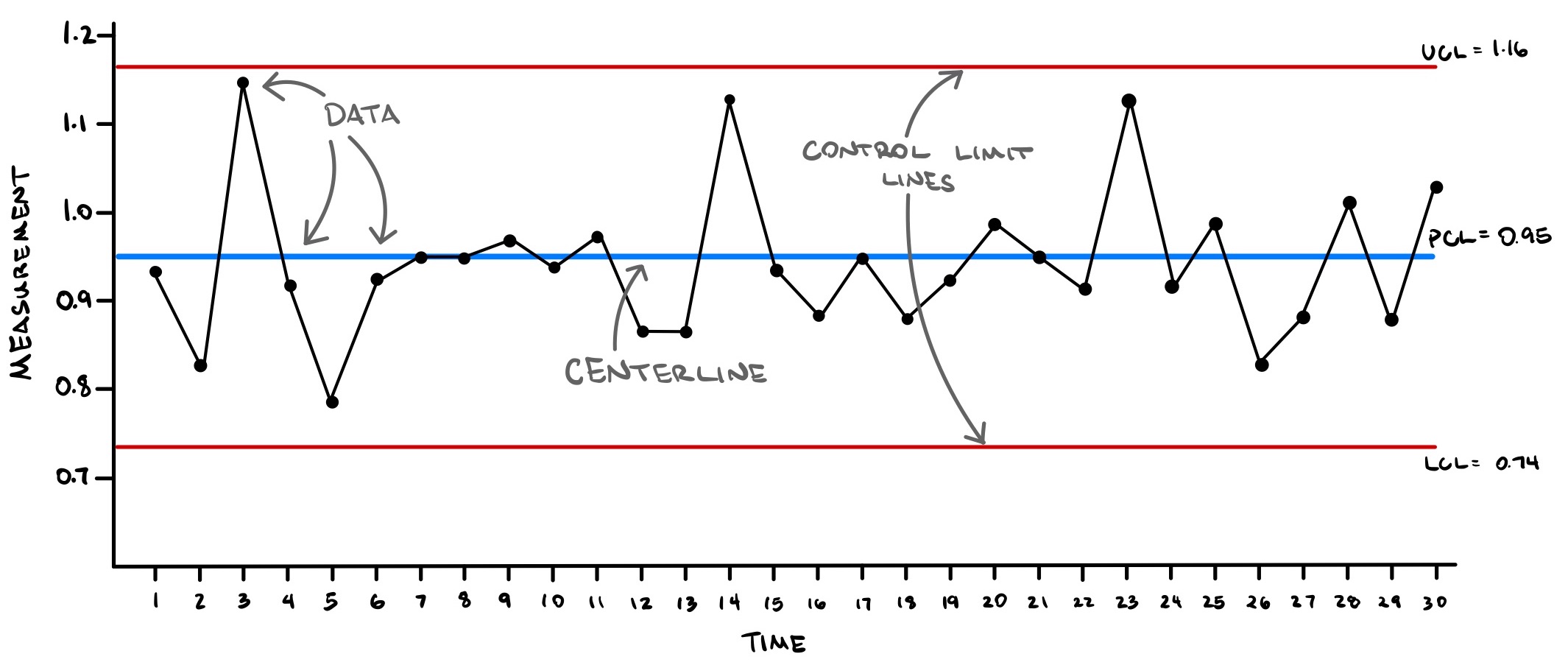
Data
These are the data points collected in time order. The x-axis is time, and the y-axis is the values (measurements) for the data collected. The line graph helps to visualize the order of the data.
Centerline
A line that shows the average for the data (in blue). Some control charts will label this line as PCL for process centerline. Here, the average of the data is 0.95.
Control limit lines
Labeled UCL for upper control limit and LCL for lower control limit (LCL), these lines (in red). These lines are calculated values usually drawn about three standard deviations away from the centerline. The method for calculating these lines is dependent on the type of control chart selected.
Beyond the basic elements
With these three elements in mind, here are a few other principles behind control charts:
- Variation. All processes have variation, and there are two types: common cause variation and special cause variation.
- Common cause variation. This is variation that we expect our process to have. The control limit lines are our predictions of the limits of variability in our process. Common cause variation is the "built-in" variability in the process and is commonly called random variability or sometimes noise.
- Special cause variation. This is the variation that we're on the lookout for. If a data point exceeds the control limit lines, or if there's a pattern in the data, then we have special cause variation. Finding special cause variation means that the process has changed somehow.
- Subgroups. Each data point is actually the average of a sample in the process. Data is collected this way to show the current value of the process and show the current variation. Control charts use data from the subgroup (short-term data) to predict long-term variation (i.e., the control limit lines).
- Out of control process. If subgroup variation can't predict the long-term variation, then a special cause in the process exists. The process is out of control. Also, if a run test rule is violated (see below), the process is out of control.
- In control process. Absent a special cause, the process is in control.
- Run test rules. These are rule sets that identify if your process is out of control. There are different sets out there, and I've linked to a few: Western Electric rules, Nelson rules (aka Stewart control rules), Westgard rules.
I'll write future blog posts on the topics above.
Control chart applications for service
If you have a process that produces time-based data, then you can undoubtedly use control charts to understand process behavior. Manufacturing processes serve as the backdrop behind most control chart examples for two reasons.
First, control charts were developed in a manufacturing setting. Walter A. Shewart developed control charts for Bell Labs' telecommunications manufacturing process in the 1920s. Edward Demming learned of the technique, become a proponent of it, and his work in Japan after World War II led to its widespread adoption in Japanese manufacturing. So control charts roots are in manufacturing.
Second, it's easy to collect time-based data for manufacturing processes. It's conceptually easy to understand how system performance can change over time in manufacturing. Maybe a die wears out, or a shift change occurs, or the surrounding temperature changes leading to a change in the product. Apparent factors like these make the conceptual connections behind control charts more readily accessible.
So this is why control chart examples are typical framed in a manufacturing setting.
But, if you have time-based data, you can monitor any given process with control charts. Manufacturing or not, your process follows some operating procedure to produce a repeated outcome. That outcome is something tangible (a manufacturing process) or not tangible (a service process).
In service settings, the trick to successfully applying these charts is having the correct data to analyze, with time-stamps, and making sure you have the right goals behind the project:
- The correct data. A common objection to data collection in service sectors like government, healthcare, and other non-manufacturing industries is that the outcomes produced aren't measurable. That's often a misconception that service outcomes can't be measured. (Here's a link to a book review on overcoming myths like this in government agencies.)
- Time-stamping. If you're already collecting data, do you have a time-stamp on each data point? A time-stamp on each data point is the necessary piece you'll need before you can apply control chart techniques. Without time, you won't be able to detect any process changes. Control charts are the best tool to see changes to your process over time and even in real-time.
- Project goals. Be sure to evaluate what you and the team are trying to achieve with control charts. Primary outcomes from control charts are to know the natural process variability and to detect process changes. But beyond that, what then? Having control charts for control charts' sake isn't a good reason for applying the technique. These charts are just tools for achieving some other, more significant business goals where you and your team have the greatest impact.
Control chart examples
If you are responsible for process improvement for your company, control charts will help you understand your system's performance. Here are a few examples of control chart applications across non-manufacturing sectors:
Project management
- Cost variance
- Schedule variance
- Frequency of scope changes
- Reliability of estimates
Healthcare
- Patient wait times
- Billing errors
- Laboratory turnaround times
- Pharmacy order filling errors
- Missed appointments
Human resources
- Number of job openings
- Number of job hiring
- Time between job opening and hiring
- Time to onboard new hires
- Cost per hire
Software programming
- Code defects
- Data quality control
- Number of support calls
- Time in resolving support calls
Accounting and finance
- Revenue per month (or quarter)
- Operating costs
- Number of accounting errors
- Rate of sales/conversions
- Invoices processed
- Processing times: invoices, collections, sales
Beyond these examples, the following are case studies in applications of control charts. The first case examines how a company solved its recruiting and hiring inefficiency with control charts. This second link provides an article on four cases where CPAs applied control charts for their accounting processes. Finally, Stacey Barr provides a "how-to" on building control charts for key performance indicators towards better organizational performance. I hope you find these case studies and articles helpful in understanding how control charts can be applied outside of the manufacturing industry.
Closing thoughts
There's quite a bit to unpack on control charts. If you have a process and can collect time-stamped data, then you have the possibility of applying this analysis method to see if your process or system is in control. If you have questions about consistency, reliability, or quality, control charts are a tool to add to your improvement toolkit.
In future posts, I'll be expanding on the topics that you read about here. For now, additional resources are below if you're interested in learning more.
Resources
As always, here are a few links for you if you're interested in understanding more about control charts. If you liked what you read, check back often as I'll post more content on control charts and how to apply them to your non-manufacturing processes.
- Amazon link to one of the best books for statistical process control: Understand Variation: The Key to Managing Chaos
- Amazon link to an excellent primer on SPC: Statistical Process Control Demystified
- Case study 1: Solving recruiting and hiring inefficiencies
- Case study 2: Control charts for accounting processes
- How to build control charts for KPIs
- Need a video? Here's a good overview on Youtube
Did you like this post?
Or find the article useful?
You should sign up for my weekly newsletter, Three Things for Thursday. I write about productivity, lean six sigma, the latest, most interesting books that I'm reading, and any cool internet finds I've come across during the week.
It's one email delivered to your inbox just before the weekend with my latest ideas on productivity, efficiency, and personal effectiveness. Sign up below and enjoy!